Today's Behind the Book is Moribito: Guardian of the Spirit by Nahoko Uehashi, translated by Cathy Hirano and edited by moi. I've already written a little bit about this book here and here, and I think it's brilliant -- fascinating and thought-provoking and exciting and moving, and, in its fight scenes, frankly kick-ass. (If you'd like a plot summary and some non-editorially-biased critical commentary, there's a terrific review up over at the YA YA YAs.) But I want to do something a little different for this BtB and explore not the artistry of the writing, but the artistry of the way in which the writing is delivered: the book design and specs (short for "special effects" or "specifications," which we use interchangeably in conversation). Thanks to designer Phil Falco and the good people of our manufacturing department, this book has a gorgeous, gorgeous package, and their work deserves as much recognition and explanation as any of the work we editors undertake; indeed, I love the look and feel of this book so much that I'm prone to stroking it whenever it's within arm's reach.
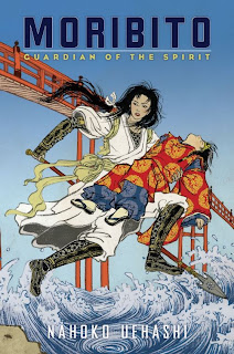
First we have the beautiful jacket, created by illustrator Yuko Shimizu. We wanted the cover to convey the book's action and strong central heroine, and to appeal to readers of both traditional novels and Japanese manga. When Phil and our art director Elizabeth Parisi brought Yuko to Arthur's and my attention, we looked through her website and saw that she plays often with all of these ideas, and we unanimously agreed that she was the perfect person to illustrate the novel. (Plus she was able to read the book in its original Japanese!) This cover shows a scene straight out of the first chapter: the female bodyguard Balsa rescuing Prince Chagum from a raging river. But when you unfold the whole jacket, it offers even more:
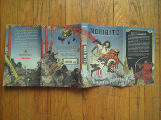 The broken bridge; the tumbling cart; the fierce soldiers: We loved the action of this image so much we gave the book extra-wide flaps (a la Harry Potter and the Deathly Hallows) to provide that much more of the panorama. We also embossed the title and author's name on the front cover and spine, and we printed the whole on a special textured paper with its rough side out (again like the Harry Potter hardcovers).
Here are the endpapers -- bright red to set off the flaps and pick up Chagum's coat from the cover. Although you can't see it, they have a subtle cross-hatched texture to them. (I can't seem to make the image go horizontal in Blogger, sorry.)
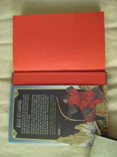
 Now we're tipping up the book to look at the spine and sides. The hard cover of a book is called its case, and when the front and back covers are one color and the spine is another, as here, it's called a three-piece case. (The paper or cloth that surrounds the case is known as the case cover.) The small strip of yellow just inside the spine, covering the glue, is called the headband; the one on bottom is called the footband.
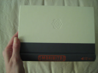
Here you see the spine of the book, and the front case cover with its "blind stamp" -- an impression on the book with no ink involved. Case covers are also often stamped with foil (cf. Elizabeth's post on A Curse Dark as Gold).
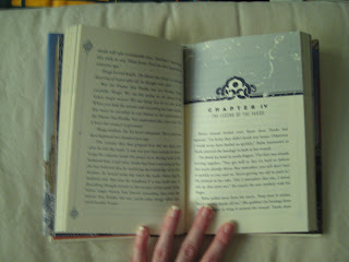
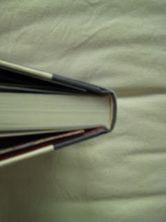
Opening up the book, we see my favorite spec -- blue ink! Isn't that cool? Phil also designed this spring's Orchard Books fantasy novel The Ruby Key by Holly Lisle, and that one is printed in purple. Phil's page design looks both ancient (the distressed pattern, the flower motifs) and modern [the blocky display type, the mid-page folios (aka page numbers)], and he did some beautiful things with the title page and table of contents, especially. (How you can tell you are listening to a book dork: I get excited about tables of contents.)
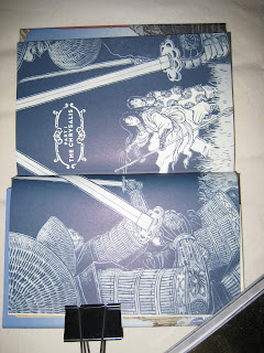
Finally, Yuko created three gorgeous interior spreads to hint at the suspense and power of the action. Here's the first, but if you see the book, be sure to check out all three -- the last one may be my favorite, as it shows Balsa charging at the awesome, awful monster Rarunga. (And sorry this one's sideways -- Blogger problems again.)
I'm now editing the translation of the sequel (Moribito: Guardian of the Darkness), in which Balsa returns to her homeland of Kanbal and much excellent political drama/martial-arts fighting/emotional healing ensues; Yuko will again be doing the cover and interiors. This series is like no fantasy you've ever read, I promise, and it's eminently worth picking up if you like good fiction, great fantasy, literature in translation, or fine bookmaking.

First we have the beautiful jacket, created by illustrator Yuko Shimizu. We wanted the cover to convey the book's action and strong central heroine, and to appeal to readers of both traditional novels and Japanese manga. When Phil and our art director Elizabeth Parisi brought Yuko to Arthur's and my attention, we looked through her website and saw that she plays often with all of these ideas, and we unanimously agreed that she was the perfect person to illustrate the novel. (Plus she was able to read the book in its original Japanese!) This cover shows a scene straight out of the first chapter: the female bodyguard Balsa rescuing Prince Chagum from a raging river. But when you unfold the whole jacket, it offers even more:
 The broken bridge; the tumbling cart; the fierce soldiers: We loved the action of this image so much we gave the book extra-wide flaps (a la Harry Potter and the Deathly Hallows) to provide that much more of the panorama. We also embossed the title and author's name on the front cover and spine, and we printed the whole on a special textured paper with its rough side out (again like the Harry Potter hardcovers).
Here are the endpapers -- bright red to set off the flaps and pick up Chagum's coat from the cover. Although you can't see it, they have a subtle cross-hatched texture to them. (I can't seem to make the image go horizontal in Blogger, sorry.)
 Now we're tipping up the book to look at the spine and sides. The hard cover of a book is called its case, and when the front and back covers are one color and the spine is another, as here, it's called a three-piece case. (The paper or cloth that surrounds the case is known as the case cover.) The small strip of yellow just inside the spine, covering the glue, is called the headband; the one on bottom is called the footband.
Here you see the spine of the book, and the front case cover with its "blind stamp" -- an impression on the book with no ink involved. Case covers are also often stamped with foil (cf. Elizabeth's post on A Curse Dark as Gold).

Opening up the book, we see my favorite spec -- blue ink! Isn't that cool? Phil also designed this spring's Orchard Books fantasy novel The Ruby Key by Holly Lisle, and that one is printed in purple. Phil's page design looks both ancient (the distressed pattern, the flower motifs) and modern [the blocky display type, the mid-page folios (aka page numbers)], and he did some beautiful things with the title page and table of contents, especially. (How you can tell you are listening to a book dork: I get excited about tables of contents.)
Finally, Yuko created three gorgeous interior spreads to hint at the suspense and power of the action. Here's the first, but if you see the book, be sure to check out all three -- the last one may be my favorite, as it shows Balsa charging at the awesome, awful monster Rarunga. (And sorry this one's sideways -- Blogger problems again.)

I'm now editing the translation of the sequel (Moribito: Guardian of the Darkness), in which Balsa returns to her homeland of Kanbal and much excellent political drama/martial-arts fighting/emotional healing ensues; Yuko will again be doing the cover and interiors. This series is like no fantasy you've ever read, I promise, and it's eminently worth picking up if you like good fiction, great fantasy, literature in translation, or fine bookmaking.