For a long time--right up until this afternoon, in fact--I thought I knew exactly what Second Sight was going to look like: a pair of glasses spanning the width of the cover, held by their outside corners by a pair of fingers, with the title type floating over them and my name below. Then my book designer stopped by my office with the bad news: This image was so thin that it didn't take up much space vertically, which left the cover looking really awkward and unbalanced . . . and altogether, it was not going to fly.
I was momentarily cast down, but like all bad ideas that get recognized as bad ideas, this helped clarify my priorities (particularly this: I REALLY want eyeglasses on the cover) and cleared the way for better ideas, of which I quickly had four. If you'll forgive the self-indulgence, I'm going to analyze these four ideas the way we analyze cover ideas in-house, for first what they say about the book in and of itself and then how the covers might connect with my intended audience (adult writers of children's and YA literature). Pardon the lousy sketching and type design.
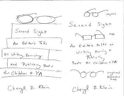 A., Left. Glasses on top of a stack of books with the title written on their spines. This looks booky; the image fills the space well; it offers an opportunity for lots of good colors on the spines (and I love bright colors) and fun glasses on top. This kind of cover has certainly been done before, but the covers it alludes to (in my mind, at least) are all good ties for the kind of book this is: Reading Like A Writer by Francine Prose, which is a similar reading-and-writing book, and Stanford Wong Flunks Big-Time by Lisa Yee and I Now Pronounce You Someone Else by Erin McCahan, which are both titles off my own list. So I like this one a lot.
B., Right. I think of this as the McSweeney's cover, as it would be mostly the gracious, formal type that's used on the inside of the book, with three or so small images of eyeglasses between the lines, most likely photographs (though it would be neat to find a cartoonist who could draw all of these glasses for cheap, if their style suited the font and the book). I was thinking a conventional or cats'-eye pair of glasses up top, a set of 3-D specs in the middle, and a Groucho Marx set down at bottom, to convey all the different ways one can look at writing, and also hopefully the book's blend of both seriousness and fun. OTOH, a pair of Groucho Marx glasses may convey not "fun" but ridiculousness or absurdity. None of those images say "books" or "writing" or "editing" directly, so a potential book-buyer would have to read the text for that, which slows down the potential buyer's emotional reaction, which slows down their buying reaction. And the images are really small, which means the cover might not reproduce well online, where it could be an inch tall on a computer screen. And as online will be one of the two primary ways I'm selling this book, it's important that it be instantly visually readable. Hrmm.
 C., Left: A page made to look like a piece of notebook paper, with a pair of glasses resting on it. . . . Maybe add a pencil too to get the writing thing across more immediately. The most obviously writerly of these options; also, perhaps, the most academic and boring. But it could be fun if it was done well. (That's the challenge with book cover concepts as with plot concepts: As great as the raw idea may seem, everything is in the execution.)
D., Right: A plain background with floating type and a stock photo of a dachshund in oversized glasses. I adore dachshunds for their dignity in the face of their physical ridiculousness, and this image is so darling that I imagine it might get a lot of readers to pick up the book. Indeed, in that way, it would connect to Rule #1 of children's publishing: Cute dogs sell. But the image ultimately suffers the same lack of instant connection to the book's subject as B. above, and having a dachshund in oversized glasses on your front cover is not, perhaps, the best way to have your serious writing book taken seriously.
So of all of these options, I'm leaning towards A. -- or whatever my book designer will come up with, which will doubtless be much more original and all-around better than anything I've tossed out here. Anyone want to propose alternate concepts or change my mind?
I was momentarily cast down, but like all bad ideas that get recognized as bad ideas, this helped clarify my priorities (particularly this: I REALLY want eyeglasses on the cover) and cleared the way for better ideas, of which I quickly had four. If you'll forgive the self-indulgence, I'm going to analyze these four ideas the way we analyze cover ideas in-house, for first what they say about the book in and of itself and then how the covers might connect with my intended audience (adult writers of children's and YA literature). Pardon the lousy sketching and type design.
A., Left. Glasses on top of a stack of books with the title written on their spines. This looks booky; the image fills the space well; it offers an opportunity for lots of good colors on the spines (and I love bright colors) and fun glasses on top. This kind of cover has certainly been done before, but the covers it alludes to (in my mind, at least) are all good ties for the kind of book this is: Reading Like A Writer by Francine Prose, which is a similar reading-and-writing book, and Stanford Wong Flunks Big-Time by Lisa Yee and I Now Pronounce You Someone Else by Erin McCahan, which are both titles off my own list. So I like this one a lot. B., Right. I think of this as the McSweeney's cover, as it would be mostly the gracious, formal type that's used on the inside of the book, with three or so small images of eyeglasses between the lines, most likely photographs (though it would be neat to find a cartoonist who could draw all of these glasses for cheap, if their style suited the font and the book). I was thinking a conventional or cats'-eye pair of glasses up top, a set of 3-D specs in the middle, and a Groucho Marx set down at bottom, to convey all the different ways one can look at writing, and also hopefully the book's blend of both seriousness and fun. OTOH, a pair of Groucho Marx glasses may convey not "fun" but ridiculousness or absurdity. None of those images say "books" or "writing" or "editing" directly, so a potential book-buyer would have to read the text for that, which slows down the potential buyer's emotional reaction, which slows down their buying reaction. And the images are really small, which means the cover might not reproduce well online, where it could be an inch tall on a computer screen. And as online will be one of the two primary ways I'm selling this book, it's important that it be instantly visually readable. Hrmm.
C., Left: A page made to look like a piece of notebook paper, with a pair of glasses resting on it. . . . Maybe add a pencil too to get the writing thing across more immediately. The most obviously writerly of these options; also, perhaps, the most academic and boring. But it could be fun if it was done well. (That's the challenge with book cover concepts as with plot concepts: As great as the raw idea may seem, everything is in the execution.)D., Right: A plain background with floating type and a stock photo of a dachshund in oversized glasses. I adore dachshunds for their dignity in the face of their physical ridiculousness, and this image is so darling that I imagine it might get a lot of readers to pick up the book. Indeed, in that way, it would connect to Rule #1 of children's publishing: Cute dogs sell. But the image ultimately suffers the same lack of instant connection to the book's subject as B. above, and having a dachshund in oversized glasses on your front cover is not, perhaps, the best way to have your serious writing book taken seriously.
So of all of these options, I'm leaning towards A. -- or whatever my book designer will come up with, which will doubtless be much more original and all-around better than anything I've tossed out here. Anyone want to propose alternate concepts or change my mind?